Breaking down the timeline for Tommy John surgery. (via Sean Dolinar)
| Jeff Zimmerman’s DL Info |
It again is time to dissect the past season’s disabled list (DL) information. I’ve been at this for quite some time. If you’ve never read this post before, or would just like to take a gander at the old data, check out the handy box at the right with my past work on the subject. Besides just looking at the 2015 data, I have decided to go a little Tableau crazy and add three interactive tables. The Tommy John surgery and comparing days lost per team graphs have been around in some form previously. The big addition is the time missed per injury. This interactive table is a great way to find the average and median days lost for any injury.
I collected DL information from MLB.com’s transaction list as I have for the past six seasons using data provided by FanGraphs and my own updates. I will start the data digging by looking at the overall year-to-year trend. Let the graphs begin.
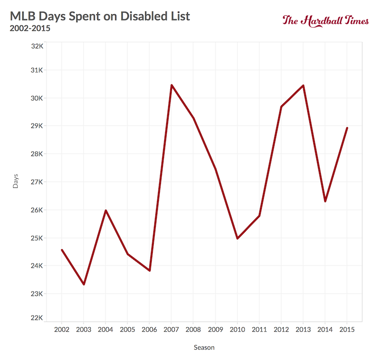
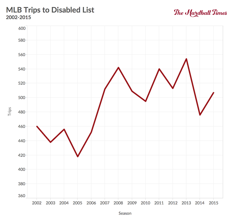
Since a decent jump in 2007, neither of the two factors has any kind of noticeable trend. Injuries over the past eight years or so aren’t up or dow; they are just staying in a normal band.
Now it’s time to break down the days and trips lost by each team this past season. Additionally, I divided the information into pitcher and hitter groupings.
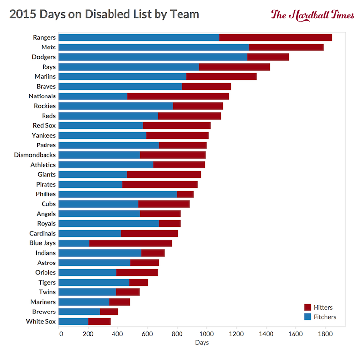
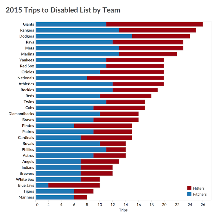
Every year I look at the data, the results just seem to keep repeating. The White Sox are in their normal position as being the league leader with the fewest days lost to the DL. Going back to 2002, their 353 days lost is the 11th-lowest total and the best showing since the 337 days lost by the 2011 Rays. One other point of interest is that the Blue Jay sent only two pitchers to the DL last season, a league low. If a team has only two pitchers going on the DL compared to the league high 15 trips the Dodgers had, that team may beat expectations, as the Blue Jays did. A little health goes a long way in helping beat expectations.
On the non-healthy end of the spectrum, the Rangers had the fifth-highest total (1,846 days) ever after setting the all-time-recorded high last season with 2,116 days lost. I am not sure why the Rangers can’t keep anyone healthy. The World Series runner-up Mets had the seventh-highest recorded total ever (1,790 days), so a high number of days missed isn’t a death sentence.
Moving on, here are the three-, five-, and 15-year totals for every team.
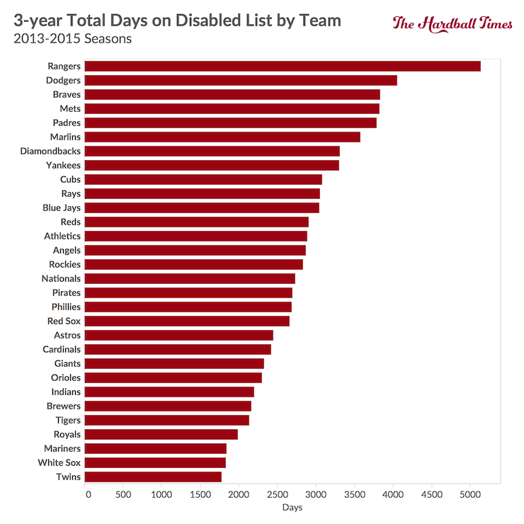
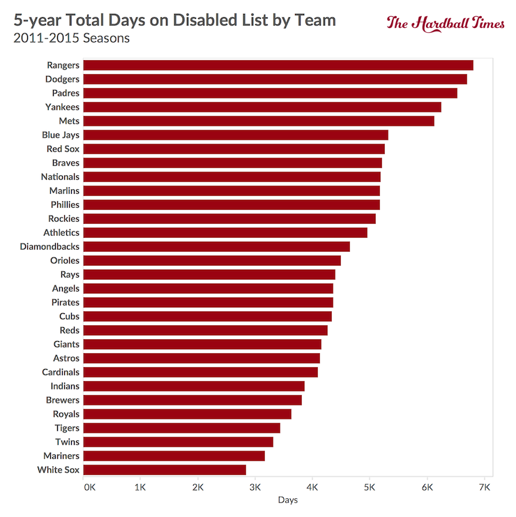

The White Sox came up 57 days short having the fewest DL days in all three time frames. Even though they are nearly the leader each time, it still surprises me by how much. In 15 seasons, the South Siders have sent players to the DL for 6,591 total days. The Dodgers (6,696) and Rangers (6,805) have topped that total in just the past five seasons.
Here is the interactive part of the article, with two updated graphs and a new one. Making a repeat appearance from last year’s article is a selectable graph comparing days on the DL between different teams and the league average.
Thanks to Bill Petti for setting up the graph initially and updating it this offseason.
An additional interactive graph I have published previously that can be helpful is the following one on Tommy John surgeries. It is fairly easy to follow and could not be possible without the help of Jon Roegele and his Tommy John surgery database.
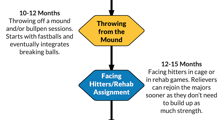
Besides the interactive graph, here is a nice visual for reference on the timeline of pitchers who returned on schedule from recent Tommy John surgeries. The list of pitchers includes Jose Fernandez, Matt Harvey, Patrick Corbin, Matt Moore, Luke Hochevar, David Hernandez, Ivan Nova, and Martin Perez. I found the average dates when each player met each rehab benchmark. I would be worried if a rehabbing pitcher begins to fall behind the benchmarks.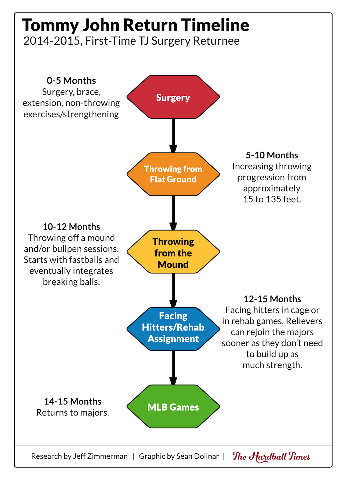
The last of the graphics is my favorite to date. With the help of Sean Dolinar, here is a selectable graph that displays the amount of time a player can be expected to spend on the disabled list if the user knows the nature of the injury. The data used are from my six years of DL data. The location (elbow, shoulder, etc.), injury type (strain, broken, etc.), and position (OF, P, etc.) can be selected from three drop-down menus.
One known issue with the graph is that it only looks at in-season DL time. If the player was dealing with an injury before or after the season, those days are not included. I would consider all the values displayed to be on the low side. Another issue is the graph only displays six years of information. As more information becomes available, the return times will become more accurate. I have set the default values to sprain/strain hamstring for hitters. It looks like most hitters should expect to miss about a month with this injury.
It was generally an uneventful year for injuries. No new team or league records were set. Tommy John surgeries didn’t claim as many pitchers, especially top-flight guys. I think any year when injuries are not the No. 1 story is a good year for baseball.
References & Resources
- Thanks to Stan Conte, formerly with the Dodgers, for reviewing and verifying the Tommy John surgery graphic.
- Thanks to Sean Dolinar for graphics assistance.
- Thanks to Bill Petti for data and graphics assistance.
- Jon Roegele’s Tommy John list
- MLB’s transaction data